Figure 6.1: How Fred.def will look
nip2 looks at the scraps of program you type in and execute and tries to show them on the screen in a graphical way. The sorts of display you get depend on where in nip2 you define the expression, and what sort of value it has.
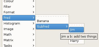
Definitions in toolkits are turned into menus off the Toolkits menu in the main window, and added to the toolkit browser. Toolkits are loaded from files at startup or can be made in the program window. Toolkit or a definition names which start with an underscore character are hidden and not displayed. The toolkits are always displayed in alphabetical order, but you can order the items within a toolkit in any way you like.
There are two ways to write toolkit definitions. Function definitions and zero-argument classes simply appear as menu items, built from static analysis of their source code. However, if a definition evaluates to an instance of the class Menu, a menu item is built from dynamic analysis of the value of the definition.
Zero-argument classes within toolkits are displayed as pull-right menus. You can nest classes to any depth.
nip2 uses the first line of the comment before a definition as help text for that function, so it’s a good idea to put a simple one-line description of the function at the start of a comment.
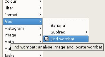
For example, if the following text is placed in a file called Fred.def on nip2’s start path, you’ll get a menu in the tookits called Fred with a pull-right and a tooltip. See Figure 6.1.
Dynamic menus give you much more control over the way menus are drawn and make it easy to reuse menus. A dynamic menu item is a class instance that is a sub-class of Menuitem. It needs to have three members: label, the text that should appear in the menu (with an underscore character to indicate the mnenonic); tooltip, a short hint that appears as a tooltip or in the toolkit browser; icon, an optional image file to be displayed in the menu next to the text; and action, the function that is called when the menu item is activated. label and tooltip are constructor arguments for Menu.
So for example:
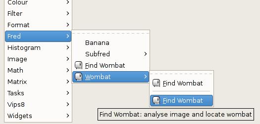
will appear as shown in Figure 6.2.
A dynamic pullright menu is a subclass of Menupullright. It’s just like Menuitem, but without the need for an action member. Any members which are subclasses of Menu are displayed as items in the submenu. So again:
will appear as shown in Figure 6.3.
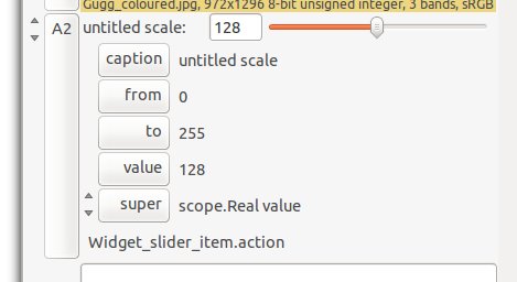
Definitions in workspaces are displayed with nip2’s class browser. Each row is displayed in four main parts: a button for the row name, a line of text, a set of sub-rows for the members of the row’s class, and a graphic display representing the row’s value. See Figure 6.4.
The text part of the right-hand-side of each row is always displayed, but the sub-rows are only displayed if the row represents a class, and the graphic is only displayed if the class is an instance of one of the classes in Table 6.5. You can subclass these if you want to use the graphic display in your own widgets.
There are three separate ways to set the value for a row. You can edit the line of program text, you can edit one of the members, or you can manipulate the graphic representation (dragging a slider, or moving a region). These can be contradictory, so nip2 resolves conflicts by always applying changes in the order text, then graphic, then member.
When it applies a graphic change, nip2 rebuilds the class using a class member called class-name_edit, or if that is not defined, the class’s constructor member. For example, the Colour class can be defined as:
There are two ways to change A1. You can open A1 and change colour_space to ”Lab”, or you can double-click on the swatch and drag the disc. When you click OK on the colour edit dialog, nip2 searches for a member called Colour_edit, fails to find it, and so picks the Colour member instead (the default constructor generated by nip2). It then replaces the value of A1 with
[needs finishing]
| Class | Description |
| Clock interval value | A clock widget, handy for animations |
| Expression caption expr | Displays an editable expression |
| Group value | A group of objects for iteration |
| List value | A list of related objects |
| Pathname caption value | Displays a file browser |
| Fontname caption value | Displays a font browser |
| Toggle caption value | A toggle switch |
| Scale caption from to value | A slider |
| Option caption labels value | Select one item from a list |
| Colour colour_space value | A patch of colour |
| Matrix_vips value scale offset filename display | A matrix |
| Arrow image left top width height | Two points joined by a line on an image |
| Region image left top width height | A sub-area of an image |
| Plot options value | Displays a plot widget |
| Image value | An image |
| Number caption value | Displays an editable number |
| Real value | Displays a real number |
| Vector value | Displays a list of reals |
| String caption value | Displays an editable string |
| Mark image left top | A point on an image |
| HGuide image top | A horizontal line on an image |
| VGuide image left | A vertical line on an image |
| Area image left top width height | A sub-area of an image, fixed in size |
say supports mioxed ops with real, vector and complex constants
This class displays a swatch of colour. If you double-click on the